Crafting Your Dream Kitchen: Harmonizing Countertops, Cabinets, and Lighting
A kitchen design can fall flat if your countertops clash with your cabinets or the room’s lighting, creating an unappealing visual disconnect. This guide is your roadmap to selecting countertops that perfectly complement your kitchen cabinets and lighting, ensuring a cohesive and stunning kitchen. We’ll demystify undertones, material nuances, and lighting effects, empowering you to choose surfaces that look fantastic and stand the test of time. By aligning color temperature, pattern scale, and finish sheen, you’ll avoid design regrets and boost your home’s appeal. Discover the latest cabinet and countertop pairings for 2025, master the art of undertone matching, explore lighting strategies (CRI and color temperature), weigh material pros and cons, and get practical care tips. We’ll provide clear guidelines, comparison tables, and actionable checklists to help you test samples, prioritize durability, and know when to call in the pros for installation or expert advice. Plus, we’ll show how cabinet painting and refinishing can solve undertone or cohesion challenges.
Top Cabinet and Countertop Pairings for 2025
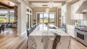
Achieving a harmonious kitchen starts with selecting a dominant cabinet tone and pairing it with a countertop that balances pattern and undertone. This creates a stable visual foundation, allowing accent elements to shine. The principle is simple: a countertop’s pattern scale and undertone either ground your cabinets or compete with them. When done right, you get a cohesive focal plane that looks great in any light. The payoff? A kitchen that feels intentionally designed, boosting homeowner satisfaction and your remodel’s return on investment. Here are some on-trend, practical combinations that work across various styles and lighting conditions, with a brief explanation for each.
These top pairings reflect the latest kitchen design trends for 2025 while remaining practical for everyday homes. They serve as a springboard for exploring style-to-material matches in the next section.
Which Cabinet Styles Shine with Popular Countertop Materials?
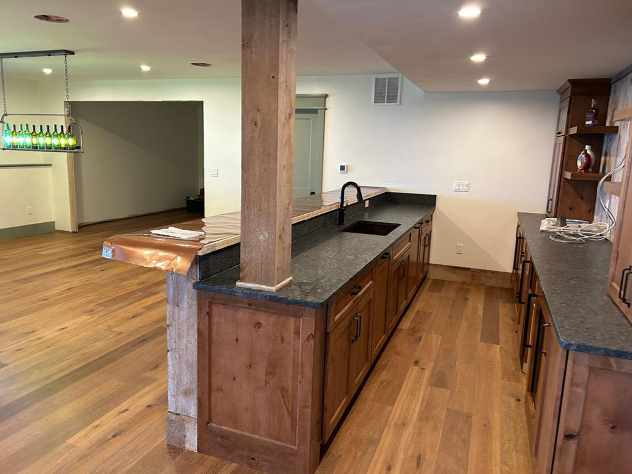
Shaker and transitional cabinets look stunning with subtly patterned quartz or honed granite. Their clean lines complement understated surfaces, allowing delicate veining to stand out without overwhelming the cabinetry. For slab modern cabinets, opt for dramatic quartz or marble-look engineered stone that offers a deliberate contrast through bold patterns or a sleek, minimalist color. Farmhouse or rustic cabinets pair beautifully with warm butcher block or soapstone, enhancing the cabinet’s texture and adding tactile warmth under any lighting. These pairings are all about matching texture scale and pattern rhythm: smooth cabinets pair well with either calm or intentionally dramatic countertops, while textured cabinets benefit from simpler surfaces to avoid visual clutter.
Understanding how styles and materials interact will help you prioritize material attributes in the next section on trends and long-term choices.
How Do Color and Material Trends Shape Cabinet and Countertop Choices?
Current design trends for 2025 lean towards mixed materials, darker lower cabinets, and matte finishes. This means countertops should be durable, low-glare surfaces that complement these bolder palettes. Trends like large-format quartz slabs and warmer engineered stones allow homeowners to choose countertops that either blend seamlessly with painted cabinets or create a striking contrast, all while being easy to maintain. Use trends strategically: incorporate bold choices on islands or as accents, and opt for more timeless surfaces on perimeter areas if resale value is a key consideration. These guidelines help you balance personal style with long-term value and return on investment, leading into a comparison of timeless versus bold options.
Deciding between trendy or timeless pairings directly impacts durability and maintenance trade-offs, which we’ll explore later.
Timeless vs. Bold: Cabinet and Countertop Color Palettes
Timeless combinations focus on neutral undertones, subtle contrast, and durable materials that have broad appeal. Think white shaker cabinets with a soft grey quartz, or warm wood cabinets with honed granite. Bold combinations embrace high-contrast pairings, such as matte black lower cabinets with white marble-look quartz, or colorful painted upper cabinets balanced by a neutral, low-pattern countertop. Timeless options generally enhance resale value and minimize redesign risk, while bold choices offer greater personal satisfaction but may require more attention to supporting elements like hardware, backsplashes, and lighting. Weighing these factors early on can help you determine if cabinet painting or targeted refinishing is a cost-effective way to achieve your desired look.
Here’s a quick ranked list to easily compare top combinations and capture key ideas.
This list ranks five practical cabinet-and-countertop combinations for 2025 and explains why each works.
- Dark lower cabinets + light quartz countertops: Offers striking contrast, easy maintenance, and consistent veining that looks great in any light.
- White shaker cabinets + warm grey honed granite: A classic neutral pairing that flatters most lighting and hides wear with its subtle texture.
- Warm wood cabinets + soapstone or butcher block: Enhances natural warmth and tactile appeal, perfect for rustic or transitional kitchens.
- Matte black slab cabinets + white marble-look quartz: Creates dramatic, modern contrast with durable engineered stone for everyday living.
- Two-tone cabinets (painted uppers, stained lowers) + neutral quartz island: Balances color with a durable, low-pattern focal surface that anchors the space.
These ranked pairings are excellent starting points. The next major section delves into how undertones can refine these matches.
The Crucial Role of Undertones in Matching Kitchen Cabinets and Countertops
Undertones are the subtle warm, cool, or neutral hues that lie beneath a surface’s apparent color. They significantly influence how colors interact with countertop veining, cabinet paint, and lighting. The key is color interaction: a cool undertone in a countertop might appear greener or bluer next to a warm-toned cabinet, and vice versa. This can create harmony or visual tension, depending on your design goals. Understanding undertones leads to predictable pairing decisions and helps you avoid costly mismatches during installation. The following sections define undertone types, provide a testing checklist, and explain how contrast can be used effectively.
Accurately identifying undertones is essential for determining if paint adjustments or cabinet refinishing are needed to achieve perfectly cohesive material pairings.
Understanding Warm, Cool, and Neutral Undertones in Cabinets and Countertops
Warm undertones feature hints of yellow, gold, or red, commonly found in woods, beige stones, and some quartz blends, bringing a cozy and inviting feel. Cool undertones include blue, green, or grey hints, often seen in cool whites, certain granites, and some marble varieties, creating a crisp, modern look. Neutral undertones lack a strong chromatic bias, acting as versatile bridges between warm and cool palettes. Recognizing these subtle cues—like gold flecks, bluish-grey veining, or balanced beige—helps you predict how a countertop will look next to your painted or stained cabinets under your kitchen’s specific lighting.
Once you grasp these undertone categories, you’re ready for a practical sample-testing method to confirm your matches in your own space.
How to Identify and Match Undertones for a Harmonious Kitchen Look
Follow this step-by-step test: bring your cabinet paint chips and countertop samples into your kitchen. View them near your main light sources at different times of the day, and photograph combinations under your typical bulbs to compare. To check for undertone alignment, place a neutral white card next to your samples to isolate the color bias. Aim to match undertones (both warm or both cool) or use a neutral countertop to bridge disparate cabinet tones. This hands-on approach minimizes surprises during installation and clarifies whether cabinet painting or a professional material selection consultation is the best next step.
Testing samples under real lighting conditions prepares you for decisions about controlled contrast, which can be highly effective when executed thoughtfully.
Can Contrasting Undertones Work in Kitchen Design?
Absolutely! Contrasting undertones can create striking, layered designs when balanced with unifying elements like hardware finishes, backsplash patterns, or repeated textures. Success hinges on limiting the contrast to one primary area (e.g., island vs. perimeter), repeating a small accent color across textiles and fixtures, and ensuring at least one neutral surface ties the scheme together. For instance, warm wood lowers paired with cool grey quartz can work beautifully if you incorporate warm metal hardware and a neutral tile that references both tones. Controlled contrast is a deliberate design choice that requires careful coordination with your lighting to prevent undertone clashes that appear accidental.
When contrast is your goal, consider refinishing or repainting cabinets so that undertones and sheen work harmoniously under your kitchen’s lighting.
Below is a table designed to make undertone pairing actionable, offering clear matching tips and important cautions.
This table helps identify common undertone types and gives matching or contrasting guidance for each.
| Surface Type | Undertone Type | Matching Countertop Undertones / Contrasting Options | Quick Visual Tip |
|---|---|---|---|
| Warm wood cabinets | Warm (gold, amber) | Best: warm granite, butcher block; Contrast: cool grey quartz with a neutral bridge | Capture warm highlights with warm LED or natural light |
| White painted cabinets | Neutral or cool | Best: neutral quartz or cool marble; Contrast: warm wood island for balance | Use a white card test to reveal hidden blue or yellow bias |
| Grey cabinets | Cool or neutral | Best: cool quartz or granite; Contrast: warm wood accents to add warmth | Test samples under ambient and task lighting to confirm tone |
| Black/matte cabinets | Neutral to warm | Best: high-contrast white or marble-look quartz; Contrast: metallic accents for cohesion | Matte finishes reduce glare and emphasize color relationships |
This undertone table clarifies pairings and prepares you for making lighting-related adjustments in the next section.
The Impact of Kitchen Lighting on Countertop and Cabinet Color Selection
Lighting dramatically alters how undertones and textures appear by influencing color temperature and spectral quality (CRI). Therefore, your countertop and cabinet choices must account for both natural light and your artificial fixtures. The science behind this is optical: different light sources shift perceived hue and saturation, changing how veining, sheen, and finish are interpreted. The benefit of understanding this is improved predictability—selecting bulbs and fixture placements that flatter your chosen materials ensures the installed result matches your vision. The following subsections define lighting types, explain color temperature effects, and offer optimization tips.
Optimizing your lighting when finalizing material choices significantly reduces the risk of undertone surprises and beautifully highlights the material qualities you want to showcase.
What Types of Kitchen Lighting Affect Color Perception?
Natural daylight, ambient overhead lighting, task lighting (like under-cabinet or pendant fixtures), and accent lighting all play a role in how surfaces look. Natural light offers a full spectrum, while many artificial sources have limited spectra and varying color temperatures. Ambient lighting sets the overall mood, task lighting reveals surface details and textures, and accent lighting draws attention to focal materials, such as an island countertop. Relying on a single lighting layer can lead to uneven color perception and highlight undesirable undertone contrasts under different conditions.
Layering different types of lighting is the next practical step to control how your cabinets and countertops appear throughout the day.
How Does Lighting Temperature Change the Appearance of Cabinets and Countertops?
Color temperature, measured in Kelvin (K), significantly shifts perception. Warm bulbs (around 2700K–3000K) enhance warm undertones and wood tones, making them feel cozier. Cool bulbs (around 3500K–4100K) make whites and cool greys appear crisper and can mute warmer hues. CRI (Color Rendering Index) indicates how accurately a light source displays colors; a higher CRI (90+) preserves the true appearance of veining and paint tones, minimizing unexpected shifts. A simple test is to view your samples under the bulbs you plan to install and then under natural daylight. If the colors change drastically, opt for a bulb with a higher CRI or adjust your palette towards more neutral tones.
Selecting the right bulbs and CRI prepares you to implement the expert lighting tips detailed in the following subsection.
Expert Tips for Optimizing Lighting to Enhance Material Colors
Begin with a layered lighting plan: ambient overhead lighting with dimmers, high-CRI task lighting under cabinets, and accent pendants to highlight your island surface. Choose bulbs with a consistent color temperature across layers (or intentionally contrast pendant temperature with task lighting for a specific effect) and always prefer CRI 90+ for accurate color rendering of your countertops and cabinet finishes. Incorporate dimmers to fine-tune the mood and color perception throughout the day, and position task lighting to minimize glare on glossy surfaces. When electrical work or major fixture changes are necessary, consult a professional to ensure your lighting design supports your material choices and meets safety standards.
These lighting strategies directly influence which countertop materials will best complement your cabinets, a topic we’ll explore next.
Choosing Countertop Materials to Complement Your Kitchen Cabinets
Selecting countertop materials involves balancing visual appeal, durability, and maintenance. Materials like quartz, granite, marble, butcher block, and soapstone each possess distinct properties that interact with cabinet styles and lighting. The key lies in their material attributes—pattern scale, sheen, porosity, and resistance to heat or scratches—which determine the best pairings with specific cabinet profiles and lifestyles. The outcome is a material selection that enhances your cabinet style while meeting your daily-use requirements. Below, we compare these materials using an EAV table, followed by concise pros and cons for each to guide your decision.
Choosing the right material also involves considering your lifestyle, such as cooking frequency and willingness to perform maintenance, which informs the durability comparisons that follow.
| Material | Durability / Maintenance | Visual Character | Best Cabinet Pairing | Typical Cost Range |
|---|---|---|---|---|
| Quartz | Highly durable, low maintenance, non-porous | Consistent color, engineered veining | Modern slab, Shaker cabinets | Mid–High |
| Granite | Durable, requires periodic sealing | Natural veining and flecks, unique slabs | Transitional, traditional cabinets | Mid–High |
| Marble | Softer, more porous, high maintenance | Bold veining, classic elegance | Classic, high-end Shaker or slab cabinets | High |
| Butcher Block | Moderate, needs oiling, scratchable | Warm wood grain, tactile | Farmhouse, warm wood cabinets | Low–Mid |
| Soapstone | Durable, stain-resistant, darkens with oil | Smooth, matte surface, subtle veining | Rustic, wood, or neutral modern cabinets | Mid |
This comparison highlights how material characteristics align with cabinet styles. Next, we’ll provide short pros/cons and specific pairing notes to help you refine your choice.
Pros and Cons of Quartz, Granite, Marble, Butcher Block, and Soapstone
Quartz offers a uniform appearance, exceptional stain resistance, and minimal upkeep, making it ideal for busy households and modern cabinets, though it can sometimes appear less natural next to real wood. Granite provides unique natural patterns and excellent heat resistance but requires periodic sealing and more careful upkeep. Marble brings timeless beauty and dramatic veining but is porous and prone to etching, making it best suited for lower-traffic areas or for owners who embrace its maintenance needs. Butcher block creates a warm, inviting look and is repairable by sanding, but it requires routine oiling and is sensitive to water. Soapstone is low-maintenance and ages gracefully, but it is typically darker and may not suit very bright, cool palettes.
How Durability and Maintenance Influence Countertop Choices
On a general durability scale, engineered quartz and granite usually rank highest for everyday resilience, with soapstone close behind for its stain resistance and heat tolerance. Marble and untreated butcher block, however, require more active care. Maintenance needs—such as sealing, oiling, and using gentle cleaners—directly impact lifecycle costs and the time homeowners spend protecting their surfaces. If you cook frequently or have young children, prioritize non-porous, scratch- and stain-resistant materials. If aesthetics are paramount and you’re prepared for the upkeep, marble or wood remain excellent choices. These practical considerations help determine whether to hire professional countertop installation or seek a material selection consultation to confirm the right balance for your lifestyle.
Can Mixing Countertop Materials Work with Your Cabinets?
Mixing materials—such as using durable quartz for the perimeter countertops and a butcher block or marble island—can effectively combine functionality with a striking focal point, provided the colors and undertones are harmonized through hardware, backsplash, or paint. Key rules for successful mixing include repeating an anchor color across materials, matching metal finishes for consistency, and keeping one dominant surface simple to avoid competing patterns. Use a neutral bridging material when combining warm and cool surfaces, and always test samples under your kitchen lighting to ensure the mix appears cohesive. When mixing materials, professional countertop installation can ensure seams, transitions, and tolerances are executed flawlessly.
If you prefer a unified look or need to resolve undertone issues without replacing your cabinets, cabinet painting or refinishing can be a game-changer, as explained in the next section.
How Professional Cabinet Painting Services Enhance Countertop and Cabinet Matching
Professional cabinet painting and refinishing services can correct undertone mismatches, adjust sheen to minimize glare, and achieve consistent color under your kitchen lighting. The process involves precise color selection, thorough surface preparation, and a factory-style finish applied expertly. The primary benefit is a cohesive aesthetic without the significant expense of replacing entire cabinets, resulting in a painted finish that harmonizes your cabinet undertones with your countertop surfaces and the room’s illumination. Below, we discuss colors and finishes that complement popular countertop materials, outline the steps involved in professional services, and explain the optimal timing relative to countertop and lighting installation.
When undertone conflicts or finish glare are concerns, professional cabinet painting services offer a targeted, cost-effective solution that can be strategically sequenced for the best results.
Cabinet Colors and Finishes That Best Complement Popular Countertop Materials
Matte or low-sheen finishes are excellent for minimizing reflections on glossy countertops and helping to neutralize undertone clashes. Satin finishes, on the other hand, can beautifully highlight wood grain and provide durable surfaces for busy kitchens. For quartz and granite with cool undertones, consider cooler whites or soft greys in an eggshell or satin finish for subtle harmony. For warm stones or butcher block, opt for cream, warm greige, or muted greens with satin or matte finishes to reinforce the warmth. Dark matte paints pair stunningly with white marble-look quartz for dramatic contrast, while stained or clear-finished cabinets preserve natural wood undertones that complement soapstone or butcher block. Choose a finish that balances durability with the desired visual effect under your specific lighting plan.
Selecting the right finish and color should always be based on sample testing and professional guidance, which leads us to the service process considerations next.
How Professional Cabinet Painting Elevates Kitchen Cohesion
Professional cabinet painting offers a repeatable, meticulous process—from consultation and comprehensive surface preparation to priming, color application, and a durable topcoat—that controls undertones and sheen with far greater precision than typical DIY methods. Professionals utilize advanced color-matching techniques and controlled spray application to eliminate brush marks and ensure consistent film thickness, which enhances light reflection and the perceived color under various bulbs. The result is a finish that harmonizes perfectly with your chosen countertops and lighting, resists wear, and maintains its color integrity over time. For homeowners seeking predictable, high-quality outcomes, hiring cabinet refinishing services significantly reduces the likelihood of finish failures and the need for touch-ups compared to amateur attempts.
Understanding the process helps you determine the ideal timing for scheduling painting within your remodel timeline, which we’ll discuss in the next subsection.
When to Schedule Cabinet Painting During a Kitchen Remodel
Ideally, schedule cabinet painting after major plumbing and electrical work is completed but before the final countertop installation. This allows painters to fine-tune color samples against the actual countertops and ensures installers can work without damaging freshly painted surfaces. If your countertops are already selected, arrange for a brief consultation and schedule painting after the counters have been templated but before final installation to perfectly harmonize undertones. Evaluate the cost-benefit: painting is often significantly less expensive than replacement and can achieve remarkable cohesion when paired with professional material selection consultation. If time or budget is tight, prioritize professional countertop installation first and plan cabinet painting as a subsequent phase to refine the final look.
Professional painting and refinishing services integrate seamlessly with other remodel trades. If you’re looking for expert assistance in selecting materials and executing installations, consider a design consultation or comprehensive kitchen remodel services during the project planning stage.
Creating a Unified Kitchen: Integrating Cabinets, Countertops, Lighting, Backsplashes, and Flooring
A truly cohesive kitchen emerges from a deliberate “Color Trio” of primary, secondary, and accent elements, combined with coordinated material scales and consistent hardware finishes. The underlying principle is strategic repetition: repeating a key tone or texture across at least two elements visually links the scheme, while varying scale and finish prevents monotony. The benefit is a balanced kitchen that feels like a unified composition rather than a collection of disparate parts. The following subsections explain the Color Trio rule, offer strategies for selecting backsplashes and flooring, and highlight common mistakes to avoid when coordinating these elements.
Applying the Color Trio rule simplifies complex integration tasks and makes decisions about backsplashes, flooring, and hardware much more straightforward.
The “Color Trio” Rule for Kitchen Harmony Explained
The Color Trio rule assigns a dominant color (often cabinets or flooring), a secondary surface (like countertops or backsplash), and an accent (such as island color, hardware, or light fixtures) to create a layered yet balanced palette. For example: Primary: warm wood cabinets; Secondary: neutral quartz countertop; Accent: matte black hardware and pendant lights. This creates visual rhythm and focal interest. Implementation involves choosing your dominant surface first, selecting a neutral or bridging secondary element, and then locking in a single accent color to be repeated across accessories and fixtures. Using this rule prevents overmatching and ensures each element has a clear role, enhancing cohesion with your kitchen’s lighting plan.
With your trio established, choose backsplashes and flooring that support these roles rather than compete with them.
Choosing Backsplashes and Flooring to Complement Cabinets and Countertops
Select a backsplash that complements your countertop undertones and balances pattern scale. If your countertop is heavily veined, opt for a simple tile or a neutral large-format slab for the backsplash. If the counter is understated, a patterned tile can serve as a beautiful accent. Flooring should anchor the space and either echo the cabinet tone or provide a neutral foundation. For instance, medium-tone wood floors pair well with both white and warm wood cabinets, while light porcelain can brighten a darker cabinet palette. Pay close attention to grout color and pattern scale to ensure grout lines don’t create visual clutter against busy countertops. These coordination rules minimize design noise and reinforce the Color Trio across both horizontal and vertical surfaces.
Proper selection of backsplash and flooring helps avoid common mistakes, which we’ll outline next with immediate fixes.
Common Mistakes to Avoid When Matching Kitchen Elements
Frequent errors include overmatching every surface, overlooking lighting interactions, and failing to test samples together—each of these can create unintended visual tension that undermines overall cohesion. Avoid painting cabinets to match a countertop sample without first testing it under your kitchen bulbs, and never assume small swatches will accurately represent full slabs; always request larger samples or photos of the material in situ. Quick fixes include introducing a neutral bridging material, incorporating a single metallic accent repeated across fixtures, or adjusting finish sheen to control glare. A final cohesion check—taking photos under your intended lighting at multiple times of day—can help catch potential issues before installation.
Following these corrective steps ensures your integrated choices perform as planned. The final major section examines durability and maintenance implications.
Durability and Maintenance Considerations for Matching Countertops and Cabinets
Durability and maintenance considerations are crucial for long-term satisfaction and maximizing your remodel’s return on investment. They involve balancing upfront costs with expected wear, repairability, and cleaning requirements. The key factor is material resilience—scratch, heat, and stain resistance—combined with the longevity of your cabinet finish, all of which influence how surfaces age together. Investing in durable countertops and properly finished cabinets reduces long-term maintenance and increases the likelihood of recouping your costs at resale. The following subsections rank materials, list essential care routines, and explain how longevity impacts ROI.
Understanding material longevity helps you prioritize which surfaces warrant a higher investment and where professional installation offers the greatest value.
| Material | Scratch Resistance | Heat Resistance | Stain Resistance | Typical Maintenance |
|---|---|---|---|---|
| Quartz | High | High (not heatproof) | Very High | Clean with mild soap; avoid harsh abrasives |
| Granite | High | High | High (sealing recommended) | Seal periodically; reseal as needed annually |
| Marble | Low–Medium | Medium | Low (prone to etching) | Wipe spills immediately; use gentle cleaners |
| Butcher Block | Medium | Low | Low (susceptible to water stains) | Oil regularly; sand and refinish as needed |
| Soapstone | Medium | High | Very High | Oil occasionally to even patina; mild cleaning |
This durability table clarifies how maintenance influences material choice and guides essential cleaning routines outlined next.
How Different Countertop Materials Rank in Durability
On a straightforward durability scale, quartz and granite typically rank highest for everyday family use due to their excellent scratch and stain resistance. Soapstone follows closely for its stain resistance and heat tolerance, while butcher block and marble require more active maintenance. Real-world issues can include scratching and heat marks on wood, etching on marble from acidic substances, and seam discoloration if engineered surfaces are poorly installed. Choosing materials based on your actual kitchen usage—whether you cook heavily, entertain often, or have light prep needs—helps align expectations with lifespan projections.
Matching durability expectations with appropriate cabinet finishes further ensures that both surfaces age gracefully and at compatible rates, a topic we’ll cover in maintenance best practices.
Best Practices for Cleaning and Maintaining Cabinets and Countertops
Establish simple daily and weekly routines: wipe down counters with a pH-neutral cleaner and soft cloths, address spills immediately on porous surfaces, and avoid abrasive pads on painted or sealed finishes. For cabinets, clean grease with mild detergent, use minimal water at seams, and promptly touch up any chipped paint to prevent further damage. Monthly checks should include inspecting seals, replenishing oil on butcher block, and verifying that under-cabinet lighting isn’t causing heat-related finish issues. Using material-appropriate cleaners and following manufacturer or installer guidance will preserve visual cohesion and reduce long-term costs.
These best practices directly influence how material longevity affects your kitchen remodel’s ROI, which we’ll examine next.
How Material Longevity Affects Kitchen Remodel ROI
Higher-end, durable materials like quartz, paired with well-finished cabinets, often yield a better return on investment because they require less upkeep and appear more current in resale listings. Conversely, high-maintenance surfaces can detract from perceived value unless impeccably maintained. Investing in professional countertop installation and cabinet refinishing services can enhance installation quality and finish longevity, improving recoup rates over time. The decision to spend more upfront should weigh your expected years of ownership, lifestyle, and local market preferences. When longevity and resale value are priorities, opt for durable, low-maintenance surfaces and professional finishes.
When you need expert assistance aligning style, durability, and lighting for a successful outcome, scheduling a design consultation or engaging kitchen remodel services can streamline decisions and execution.
- Material selection and installation checklist: Test large samples: Evaluate slabs and paint samples in your kitchen lighting at multiple times of day. Prioritize CRI and color temperature: Choose lighting that renders colors accurately against samples. Plan sequencing: Coordinate countertop templating, professional countertop installation, and cabinet painting/refinishing to minimize damage and ensure cohesive undertones.
These actionable items will help you finalize your choices or identify areas where professional support would be beneficial.
This article has guided you through selecting countertops that perfectly match your kitchen cabinets and lighting. We’ve covered trend-based pairings, undertone testing, lighting impacts, material comparisons with EAV tables, the roles of cabinet painting and refinishing, integration rules like the Color Trio, and durability/maintenance trade-offs. For homeowners seeking help translating these principles into a practical project plan, a design consultation or targeted professional countertop installation and cabinet refinishing services can provide expert material selection consultation and flawless execution to deliver the cohesive kitchen you envision.
LED Color Temperature and Illuminance in Kitchen Design
The findings indicate that within a restaurant setting, LED lighting at 2700 K is more effective at enhancing atmospheric pleasure compared to LED lighting at 5600 K. Furthermore, the study revealed that 5600 K elicits a higher level of arousal than 2700 K. A warmer color temperature was found to augment participants’ perception of privacy. Additionally, participants reported increased sensations of pleasure, arousal, dominance, and spaciousness with rising illuminance levels. Conversely, a reduction in illuminance correlated with an enhanced sense of privacy. The interplay between color temperature and illuminance demonstrated that the combination of 2700 K and 500 Lux yielded the highest sense of pleasure, whereas a medium illuminance of 2700 K at 300 Lux conveyed the greatest sense of clarity.
Effects of LED color temperature and illuminance on customers’ emotional states and spatial impressions in a restaurant, 2015